Draft v1 – generated 2025-08-13
Intro: Why Outfits Matter for Family Photos
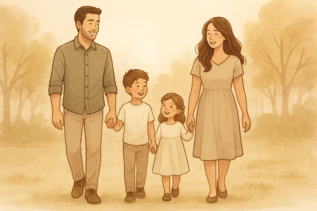
Not long ago, a family called me the night before their session. Their question was simple but urgent: “What should we wear for family photos?” The parents were worried that mismatched outfits would ruin their portraits, while their teenage daughter wanted to wear her favourite bright dress. This is one of the most common questions I hear—and for good reason. Clothes set the tone for your photos.
The good news? Dressing for family portraits doesn’t have to be stressful. With a little planning, you can create a look that feels natural, flattering, and timeless. This guide covers what to wear for family photos, including color palettes that work, outfits to avoid, and tips for seasonal and special-occasion shoots.
The Golden Rule — Harmony Over Uniformity
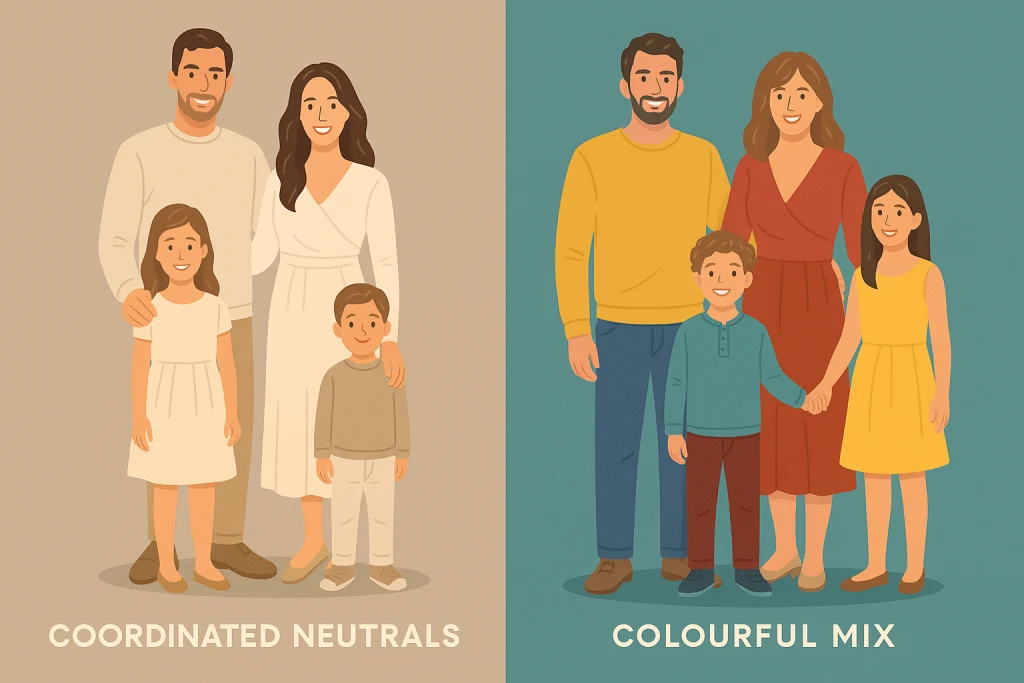
The first rule of family photos: you don’t all need to wear the exact same thing. Matching white shirts and jeans may have been popular in the 90s, but today’s family portraits shine when there’s variety with a sense of harmony.
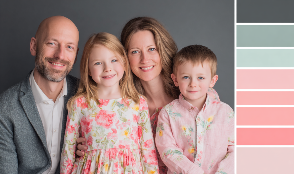
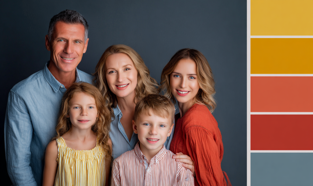
- Choose complementary colours, not identical ones. Soft neutrals, earthy tones, or pastel shades often photograph beautifully.
- Think in palettes, not uniforms. One family member can wear a floral dress, another a solid color that pulls from that floral pattern.
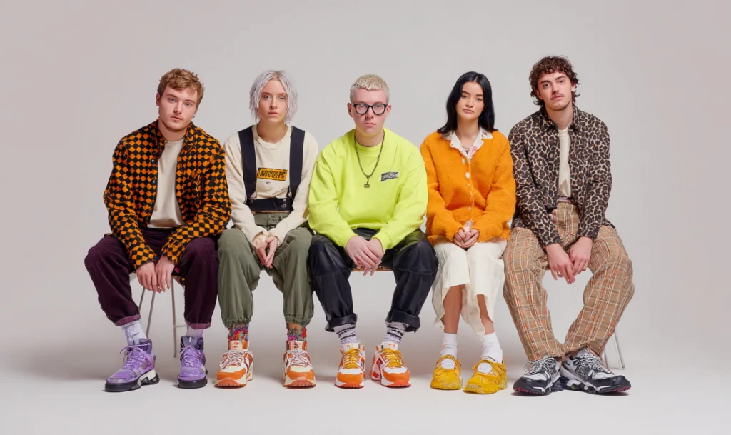
- Don’t be afraid of bright colours. Sometimes an array of vibrant tones works well, especially if you’re aiming for a playful, candid feel.
The goal is connection, not perfection. When colours flow together, the family looks united without appearing staged.
What NOT to Wear
Even though there’s flexibility, there are some things to avoid because they simply don’t photograph well. A few missteps can shift the attention away from your family’s faces and the emotions you want to capture:
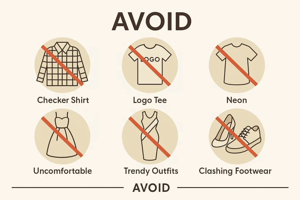
- Stripes and checkered patterns – these confuse the lens’s autofocus and can cause a moiré effect. Even small stripes or tight plaids can create visual noise that distracts from the overall portrait.
- Logos or text-heavy shirts – they distract from faces and look dated quickly. A slogan may feel fun now, but can take away from timelessness in the final print.
- Neon tones – bright neon colours can cast unnatural reflections on skin and overwhelm other tones in the image.
- Uncomfortable clothing – if kids are tugging at collars or parents feel stiff in formalwear, it will show in their expressions and posture.
- Overly trendy pieces – fashion-forward outfits might feel current, but they can date a photo within a season. Stick with classic pieces for longevity.
- Clashing footwear – shoes in loud colours or with cartoon prints can stand out awkwardly in an otherwise coordinated image.
Keep the focus on expressions and relationships, not distractions. When in doubt, choose simplicity and let your family’s connection be the highlight of the photo.
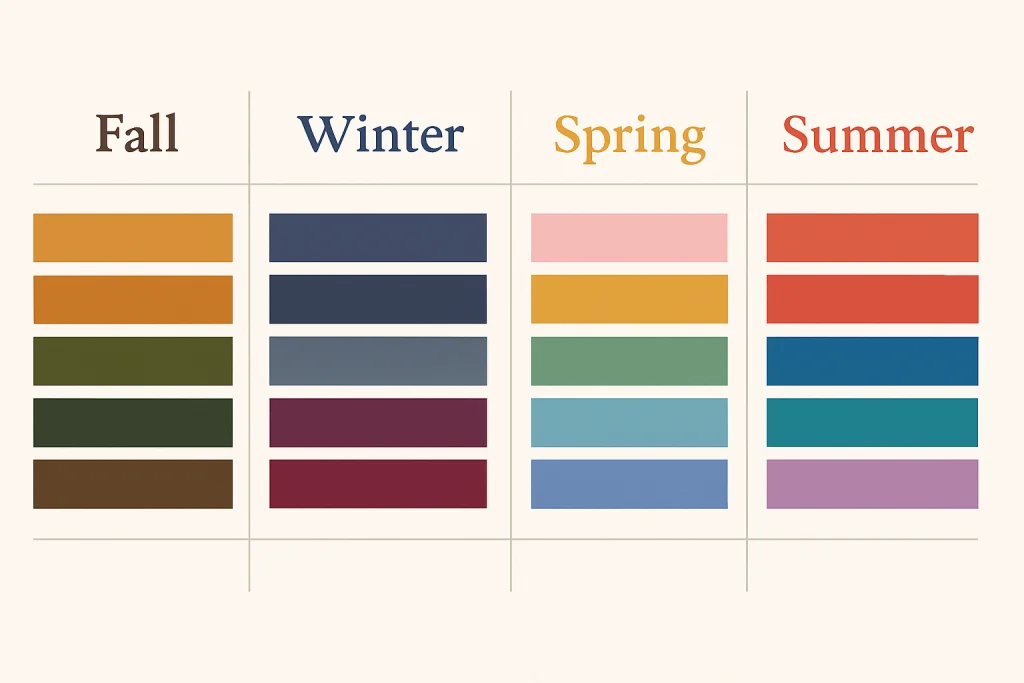
Seasonal Colour Palettes for Family Photos
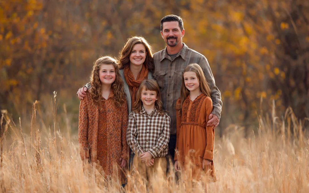
Fall
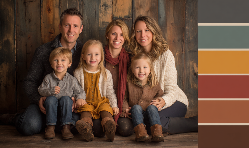
Earth tones shine in autumn: rust, mustard, olive, cream, and denim. These colours complement fall leaves and golden light. Think cozy knits, boots, and layers.
Winter
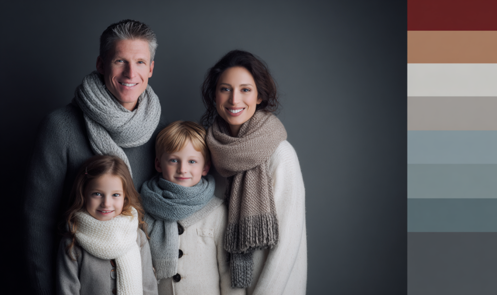
Jewel tones like emerald, burgundy, navy, and charcoal work beautifully. Metallic accents like gold or silver are perfect for holiday sessions. Add scarves and textures for warmth.
Spring
Pastels embody spring: lavender, blush pink, mint, sky blue, and soft yellow. Pair flowy dresses with light sweaters and neutral shoes.
Summer
Bright but balanced palettes rule: coral, aqua, crisp white, khaki, and denim. Sundresses, rolled-up sleeves, and sandals keep the mood airy.
(Pro Tip: Think of your environment—complement it, but don’t blend in. Avoid too much green in forest sessions or all white at the beach.)
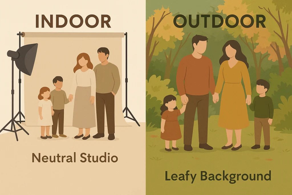
Indoor vs. Outdoor Considerations
Outdoor Sessions
Blend with nature but don’t disappear. Earth tones look great in parks, while bright colours can pop against muted backdrops. In urban locations, neutrals with one bold accent piece photograph well.
Indoor Sessions
Studio sessions give you more control. Neutral backgrounds allow pops of colour, while cozy textures (knits, lace, linen) add depth. Soft, light colours often pair well with controlled lighting.
(Lighting Tip: Darker colours absorb light and create a moodier look, while lighter colours reflect light for a softer, brighter image.)
Matching the Occasion
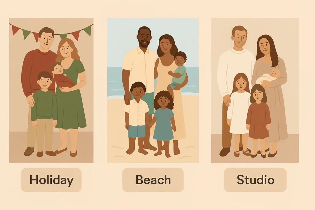
Christmas & Holidays
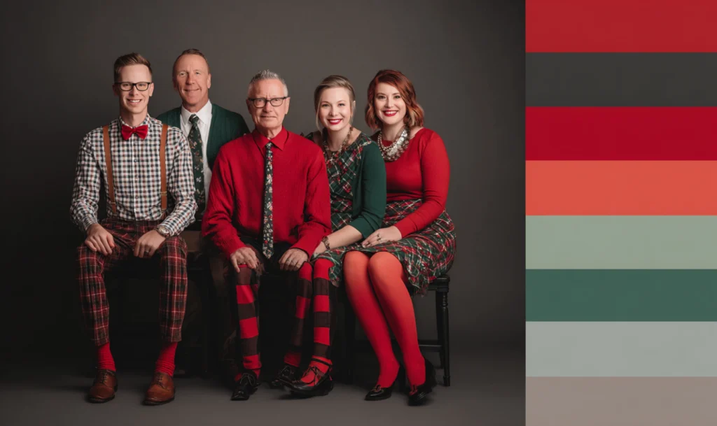
Reds, greens, creams, and metallics create festive cheer. Cozy sweaters and coordinated accessories (like Santa hats) can add personality.
Beach Sessions
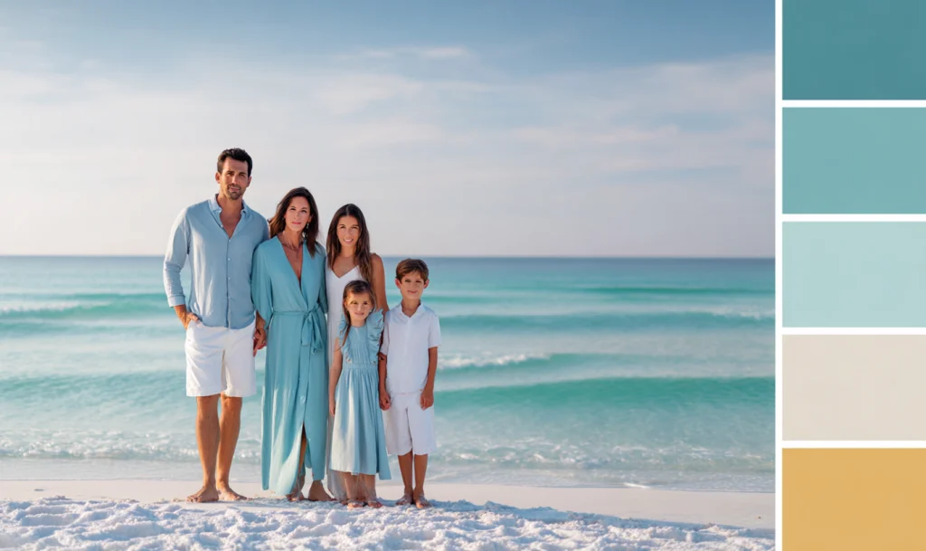
Whites, light blues, khaki, and aqua blend with sand and sea. Flowing dresses and rolled-up pants keep it natural.
Formal Portraits
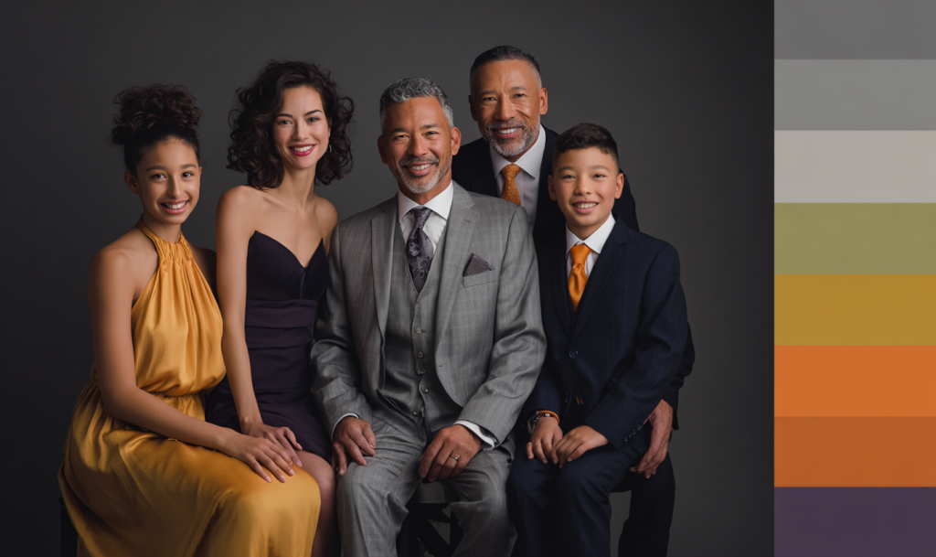
Navy, burgundy, black, and jewel tones give an elegant, timeless look. Think dress shirts, dresses, and polished shoes.
Casual Lifestyle Shoots
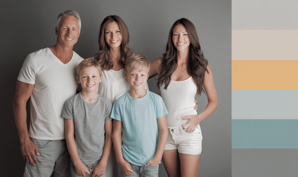
Denim, soft knits, and barefoot shots feel warm and candid. Layering cardigans or light jackets can elevate casual wear.
Professional Tips (Research-Driven)
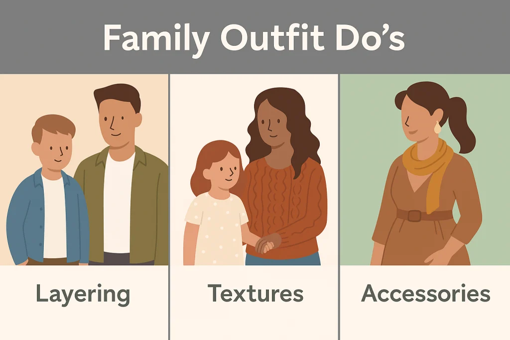
- Layering adds depth. Cardigans, jackets, and scarves can create dimension without clutter.
- Accessorize thoughtfully. Hats, jewelry, or belts should add, not distract. Avoid too many bold pieces at once.
- Texture photographs beautifully. Linen, lace, knits, and corduroy catch the light in interesting ways.
- Shoes matter. Clean, neutral shoes or barefoot look better than loud sneakers.
- Hair and makeup: keep natural but polished. For women, soft curls or simple updos frame faces well.
- Use colour theory. Complementary palettes (blue with orange, purple with yellow) create harmony. Analogous palettes (three neighboring colors on the wheel) feel soft and coordinated.
Planning Outfits Without Stress
Outfit planning doesn’t have to cause tension. Here’s how to make it easier and more enjoyable:
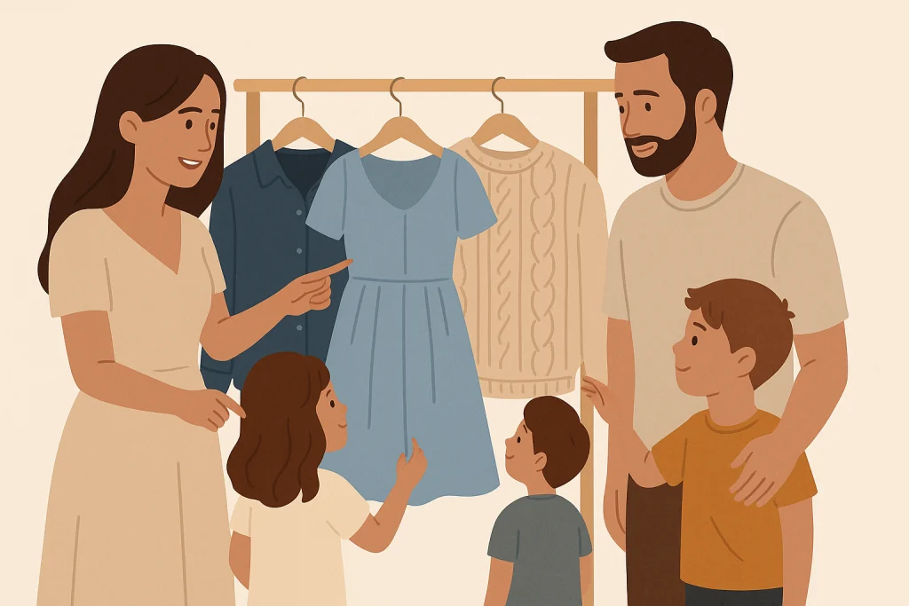
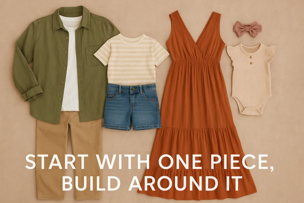
- Start with one outfit. Often, mom’s dress or the oldest sibling’s look sets the tone. Pick a piece that feels special and confident.
- Build around it. Pull colours from that first outfit for everyone else. Think about complementary tones or subtle contrasts that look good side by side.
- Lay it all out. Arrange the clothes together on a bed or floor. You’ll see instantly if the palette works, and you can adjust before the big day.
- Keep it comfortable. Kids are happier in clothes they can move in. Choose fabrics that feel soft and outfits that allow play.
- Less is more. Simple palettes often age better and feel timeless. A few classic pieces will outlast trendy styles.
- Add layers and textures. Cardigans, scarves, or a denim jacket can add variety without being overwhelming.
- Coordinate accessories. Subtle jewelry, belts, or hair bows can tie outfits together while still letting personalities show.
📌 See Family Photography Sessions
FAQ — Parents’ Most Common Outfit Questions
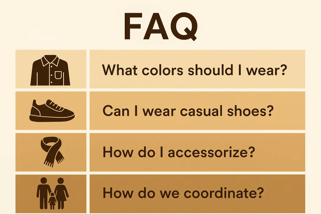
Should we all wear the same colour?
No. Coordination is better than matching. Choose a palette and let each person express it differently.
Can kids wear patterns?
Yes, but keep them small and subtle. Tiny florals or polka dots work better than bold stripes.
What about shoes?
Neutral or barefoot is best. Avoid neon sneakers or character shoes.
Do accessories help or distract?
Keep them minimal. One or two accents are perfect.
What if we forget something?
A professional studio will help you adjust. Don’t panic—creativity goes a long way.
Closing: Let Your Personality Shine
At the end of the day, outfits should reflect your family’s personality. Whether you love soft neutrals or bursts of color, your connection will outshine everything else.
So don’t overthink it. Choose outfits that make you feel good, coordinate instead of match, and remember that laughter, hugs, and genuine smiles are the best accessories of all.